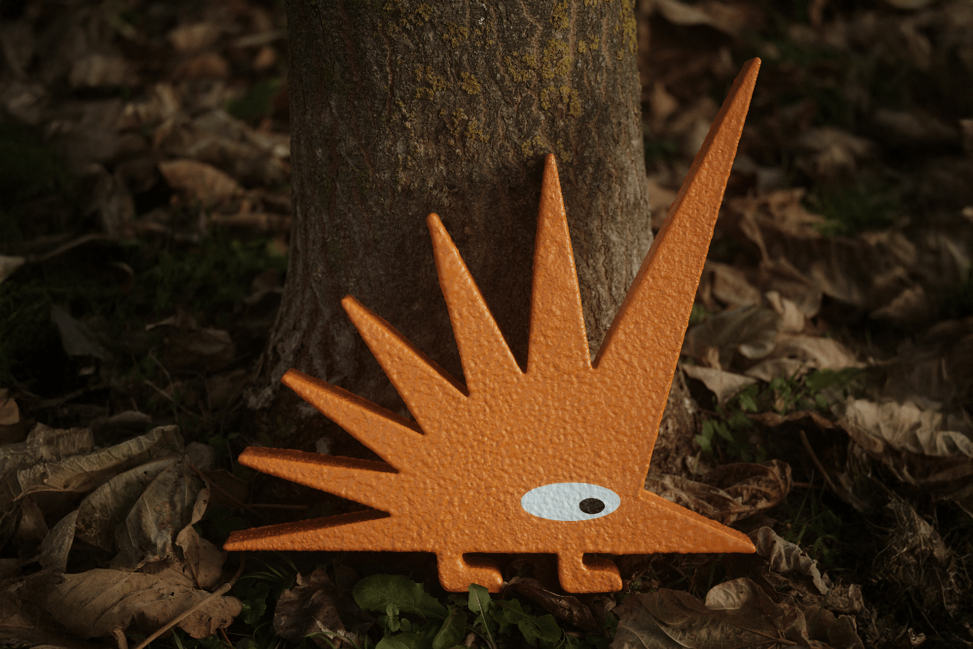
Brumen biennial
The Brumen is a Slovenian biennial with an international jury charged with selecting the best design work from the past two years. The identity focused on the linguistic bond between excellence and deserts. Phrases like “cherry on the top” or “crème de la crème” are often used to describe something exceptional. Abundant amounts of whip cream used for the identity tried to hint at the light vanity and self-admiration of designers and behind all of our awards and competitions.



The cherry system
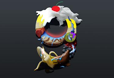
Number 9 had to be depicted as the main image on the poster of the 9th biennial
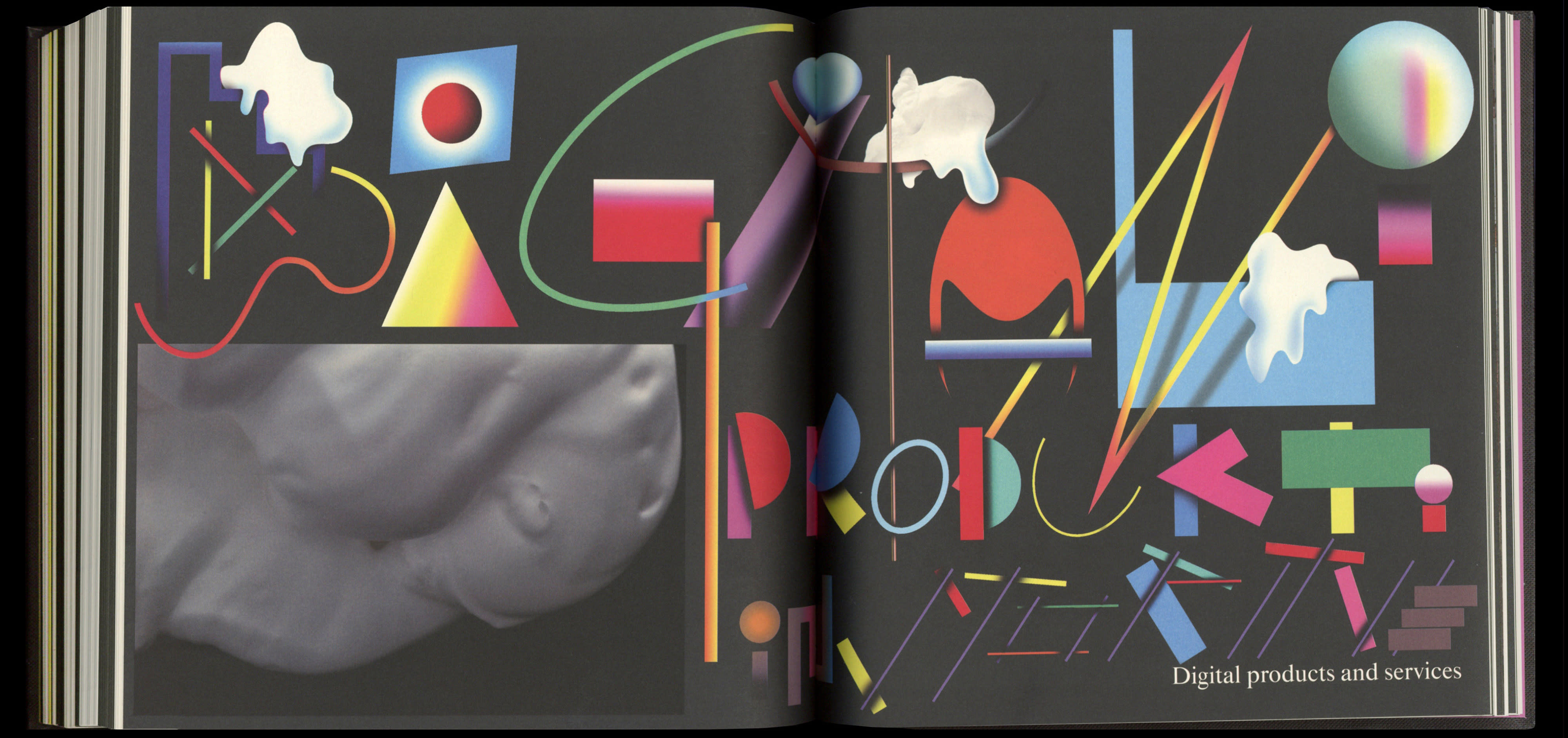
Illustrated spreads in the catalog

Slovenian titles were illustrated, while English ones served as subtitles
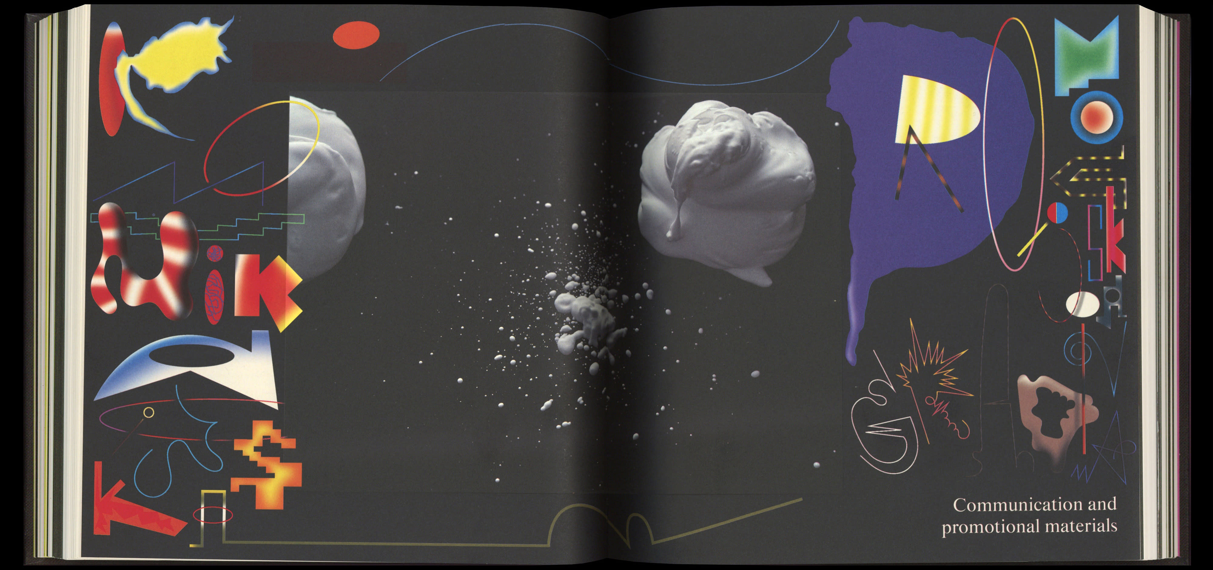
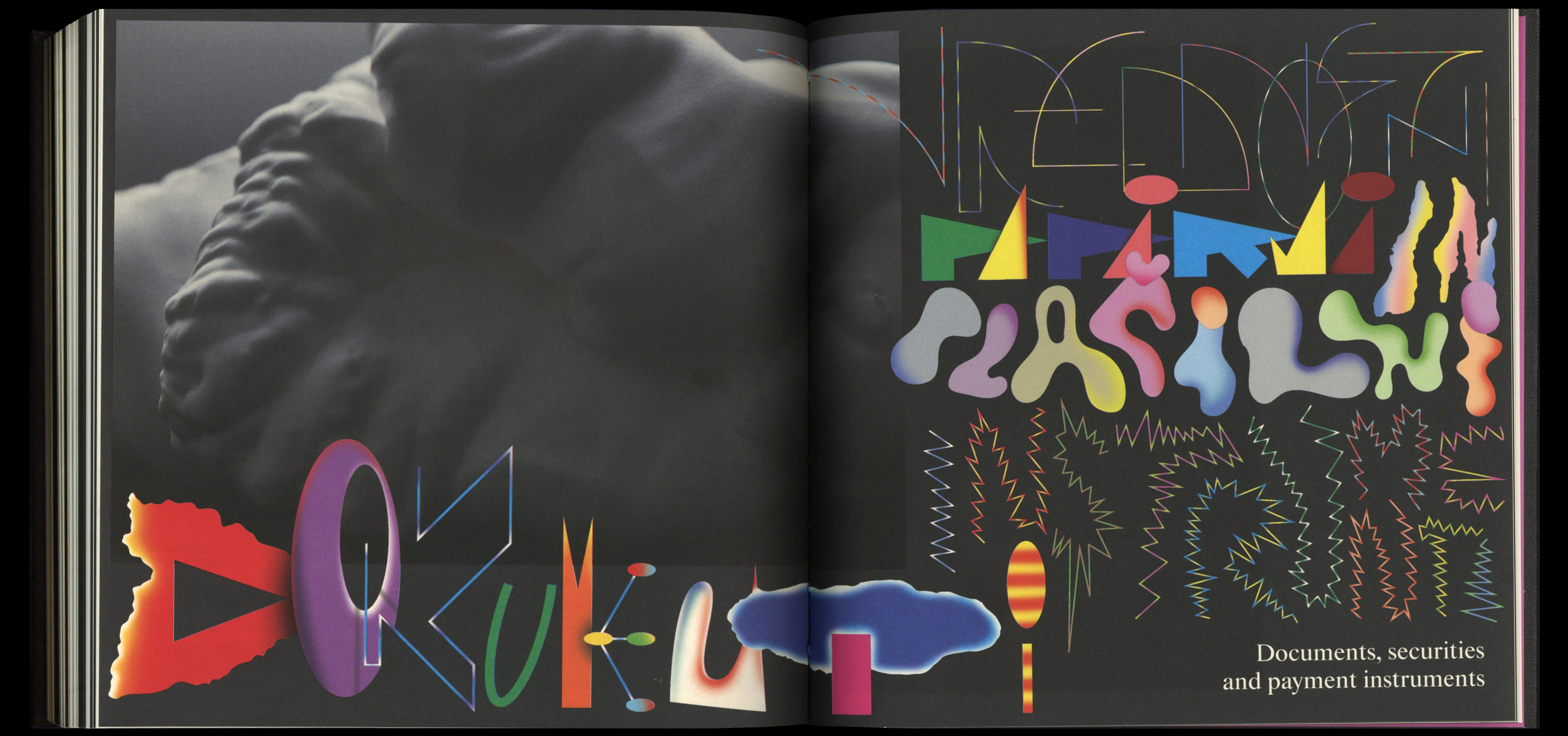




Various illustrations were developed for the event; these in particular were used as signage



Catalog section illustrations
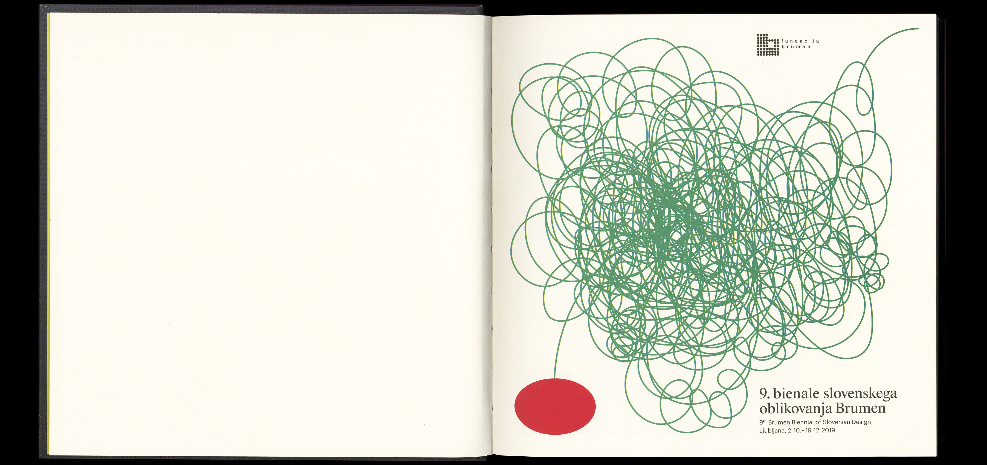
Opening illustration for the catalog


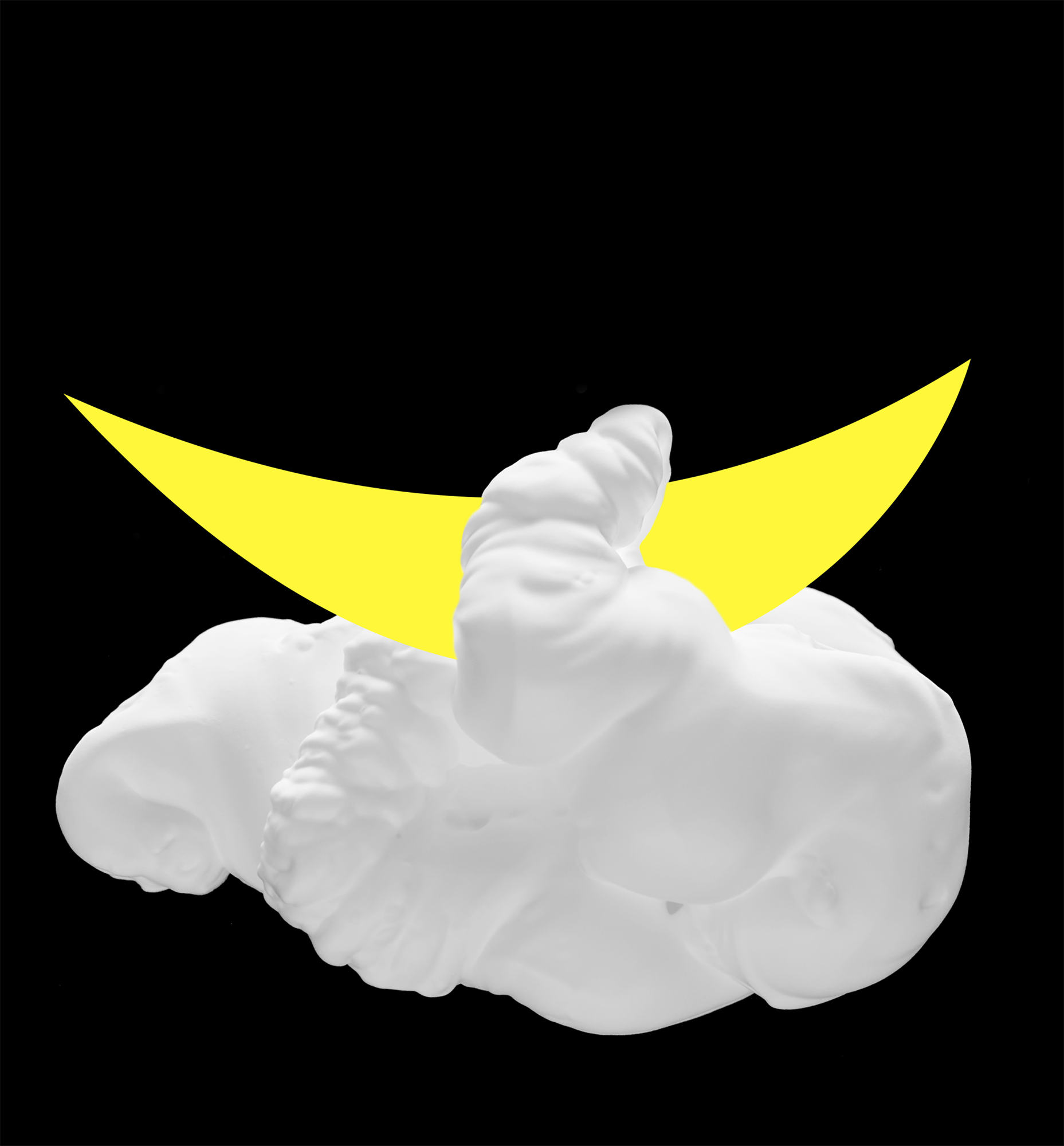

Poster for one of the events with Celtra
