Celtra
For a rebrand of Celtra, a tech company based in the US, I collaborated with Ljudje Studio from Ljubljana. We developed a new visual identity, making sure the company stood out amongst all the other marketing-technology companies. We developed several different elements of the identity (graphics, variable font, illustrations) and tied them all into a unifying grid, the backbone of the identity that holds all of the pieces together.
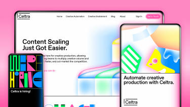

Blog on their website
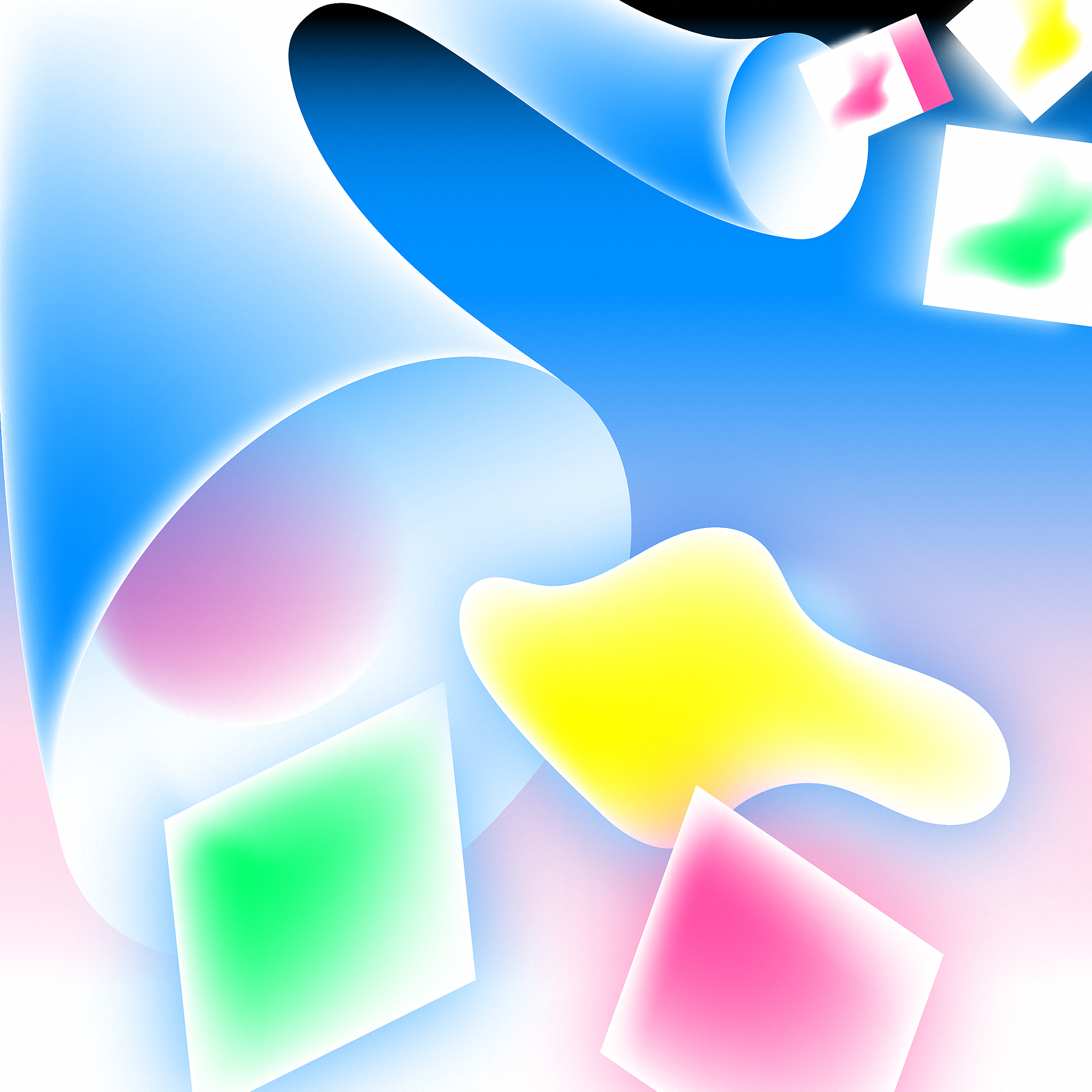
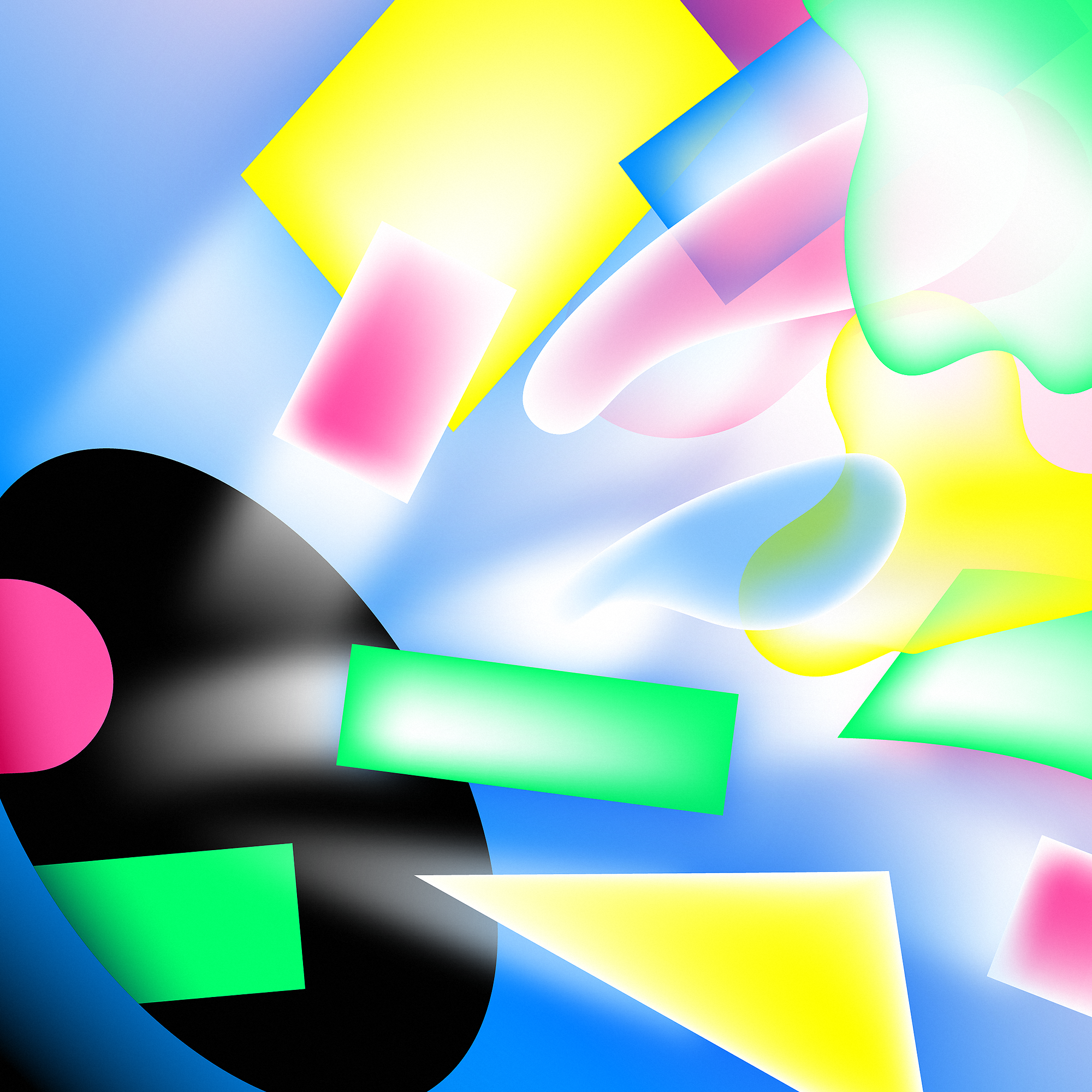
A large set of graphics was developed, mostly to visualize the often abstract things that they do and the terms they use, such as “creative automation,” “scaling,” or “content gap.” All of the graphics use the same set of colors and gradients, as well as a specific style that separates them from the typical illustrations on such websites.


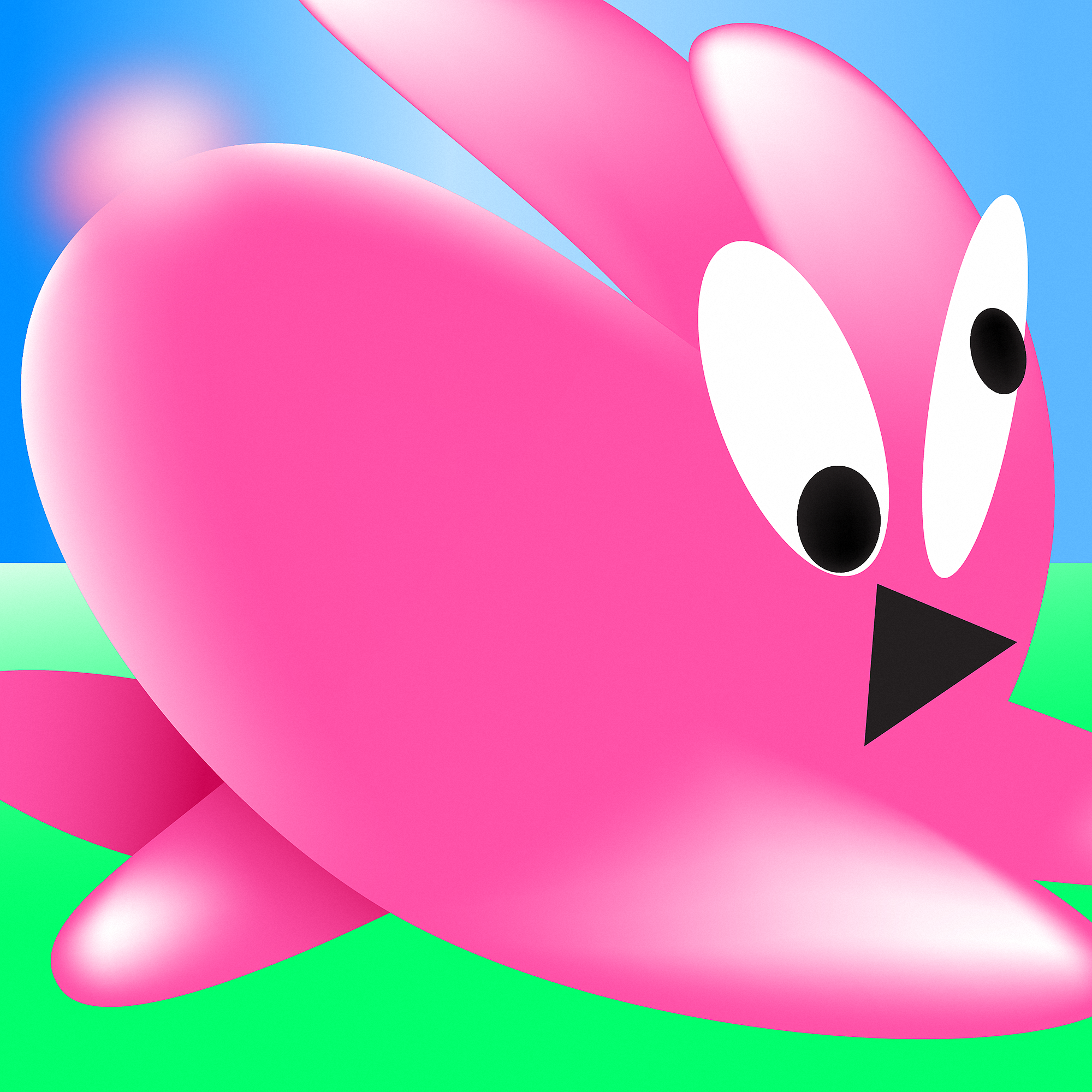


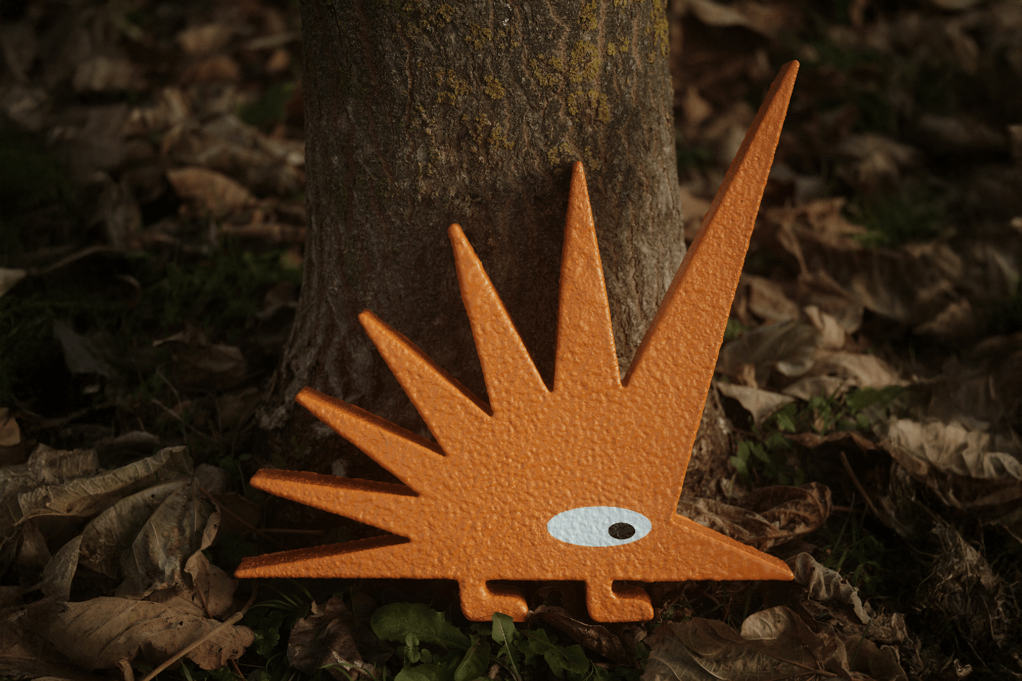
One of the illustrations, a pink rabbit, was later transformed into a 3D object, an award for the best employees.
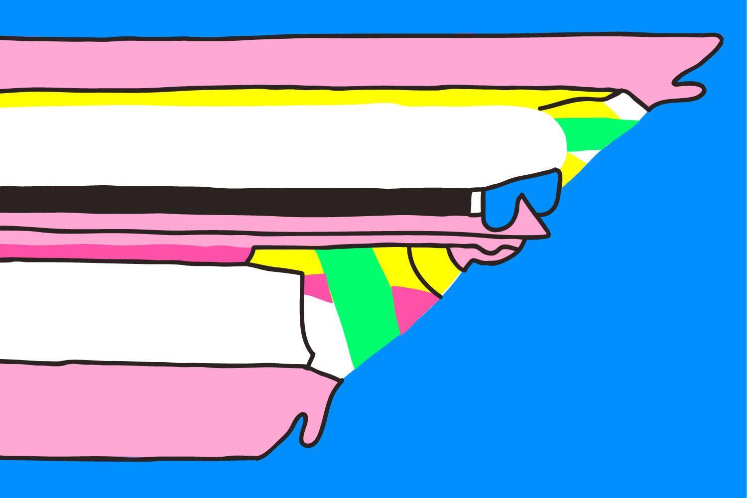
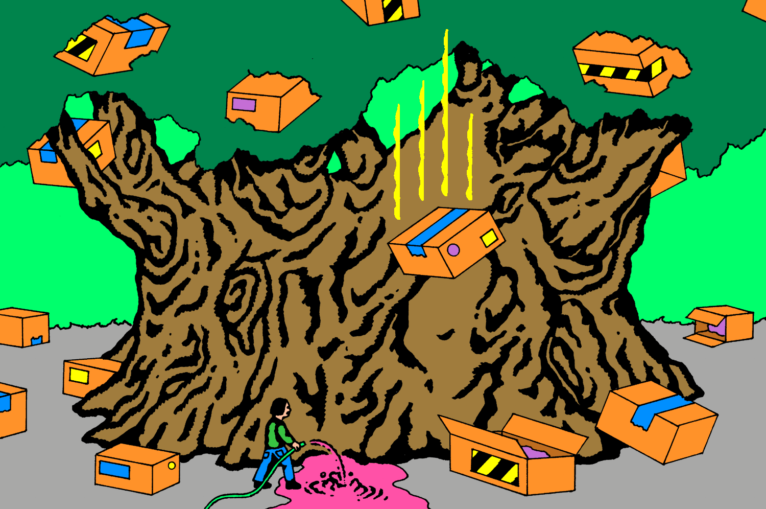
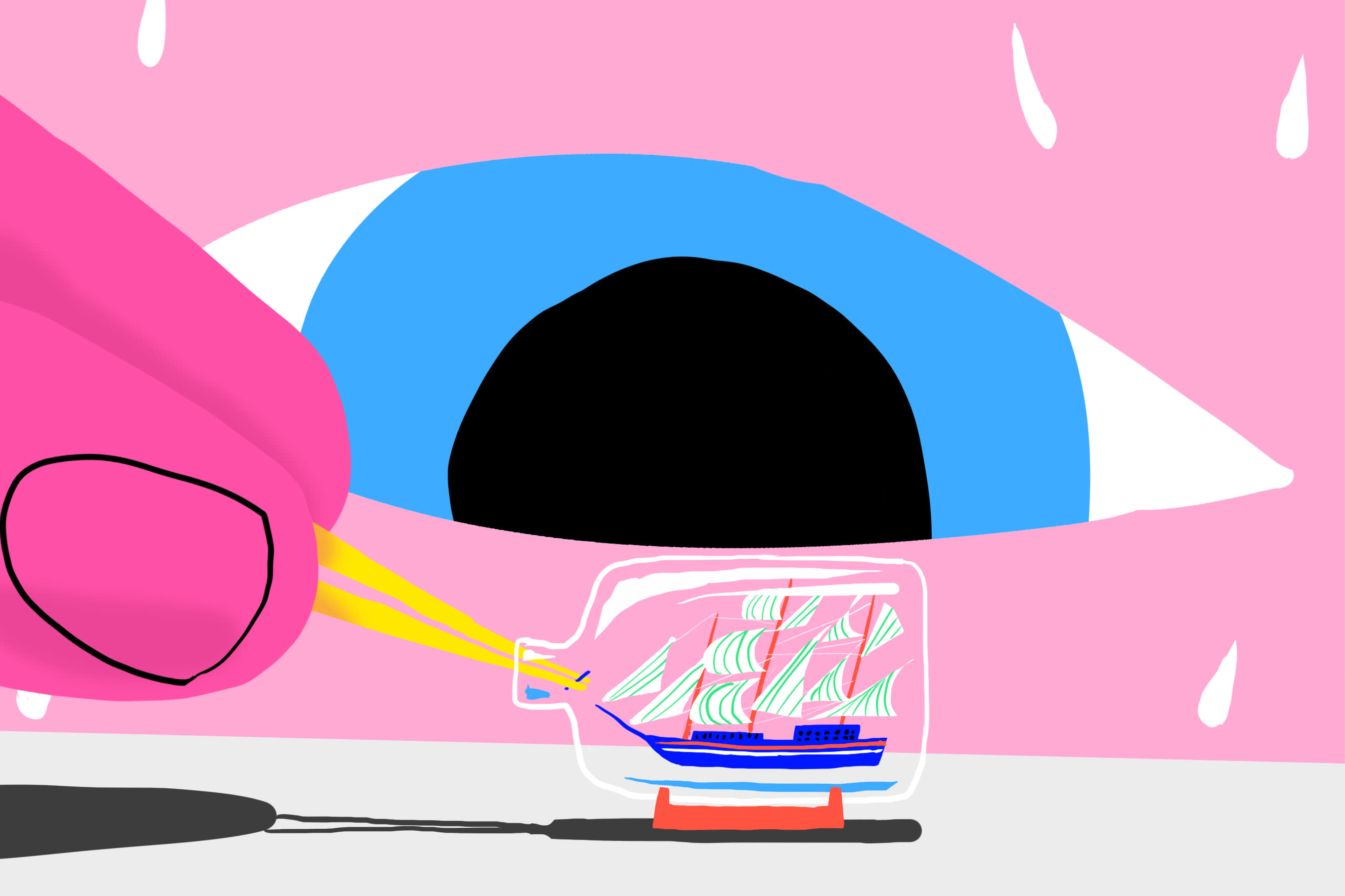
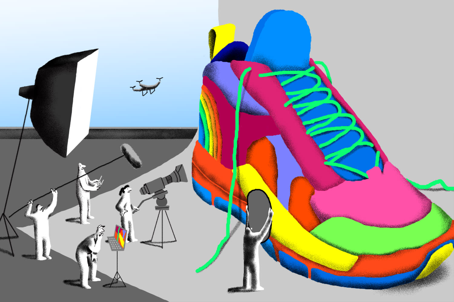
Their old blog got a fresh look and we started art-directing illustrations for the articles. Illustrators had to follow our color scheme but were otherwise free to work in their own style. We worked with a number of local illustrators from Ljubljana as well as some from around the globe.
We also made them a custom variable typeface called Nitro. It’s a display cut, made with 3 different axis and numerous variations in width and shape. Its primary function is not legibility (while it is, of course, legible) but visual power and boldness that can make each of their assets stronger and visually distinct.

Nitro, a custom display-variable typeface


Various widths can be achieved by adjusting one of the three axes

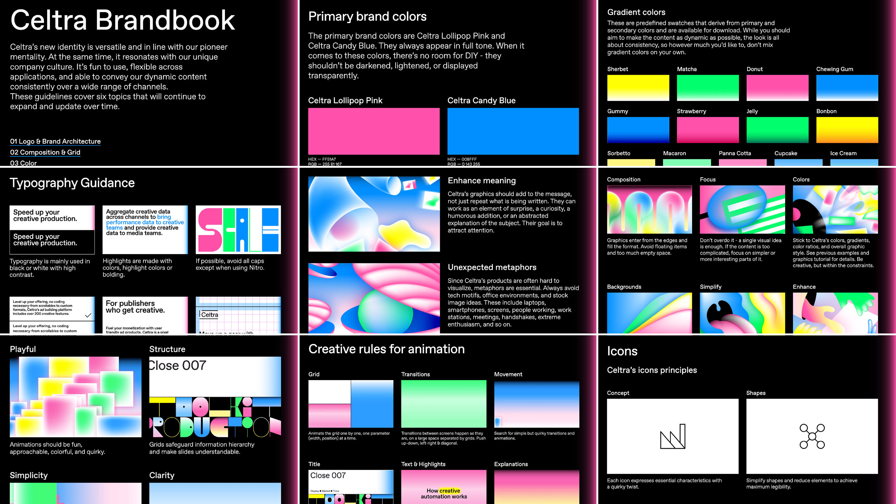
Brandbook overview
