Center Rog
Center Rog is a new production space in an old bicycle factory in Ljubljana. With over 10.000m², the building is big and hosts 10 different production labs, 20 studio spaces, a bistro, bar, restaurant, 7 shops, and a library. Together with Ansambel, I worked on an identity which included everything from core brand to building signage, web design and campaign graphics.


The identity had to distinguish Rog from feeling like another art institution. There are a few building blocks forming the visual language. Besides the standard trio logo-typography-color, we also worked on a collection of photography and illustrations, a set of icons, and a set of “frames”. Rather than a strong unified visual language, we wanted an identity that functions as a loose and growing collection of elements with a similar feel.


Typographic system, based on the distortion of the single-stroke typeface, applied across signage, printed matter, campaign posters and packaging.


Fall 2023 campaign posters on a city bus
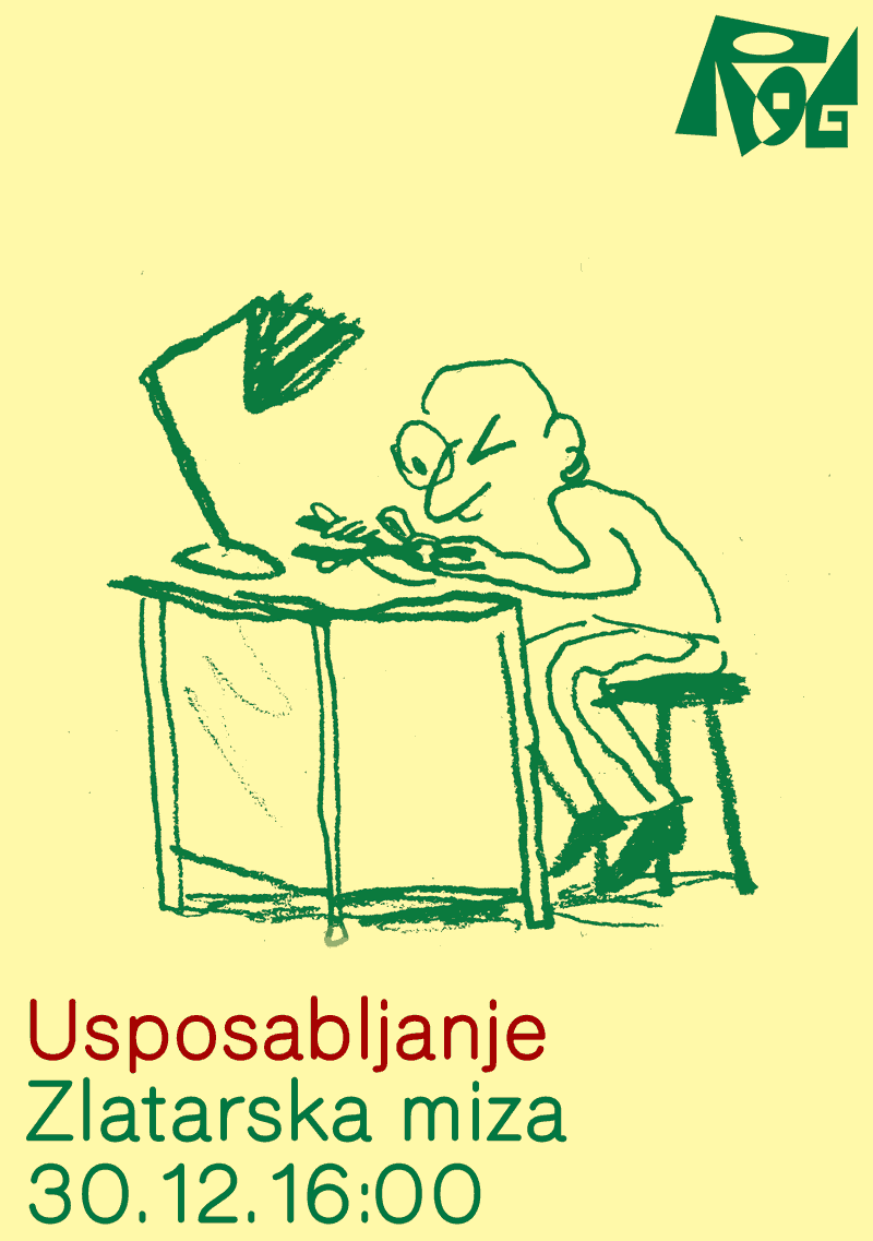
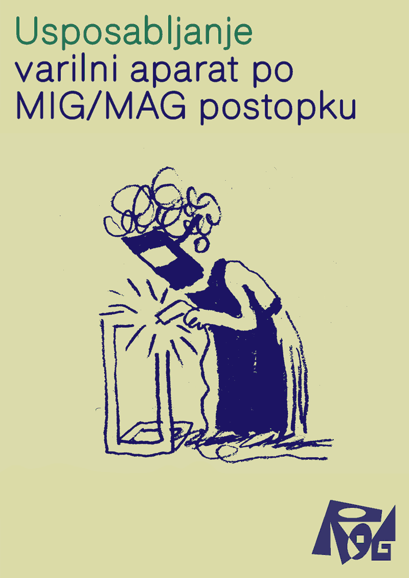
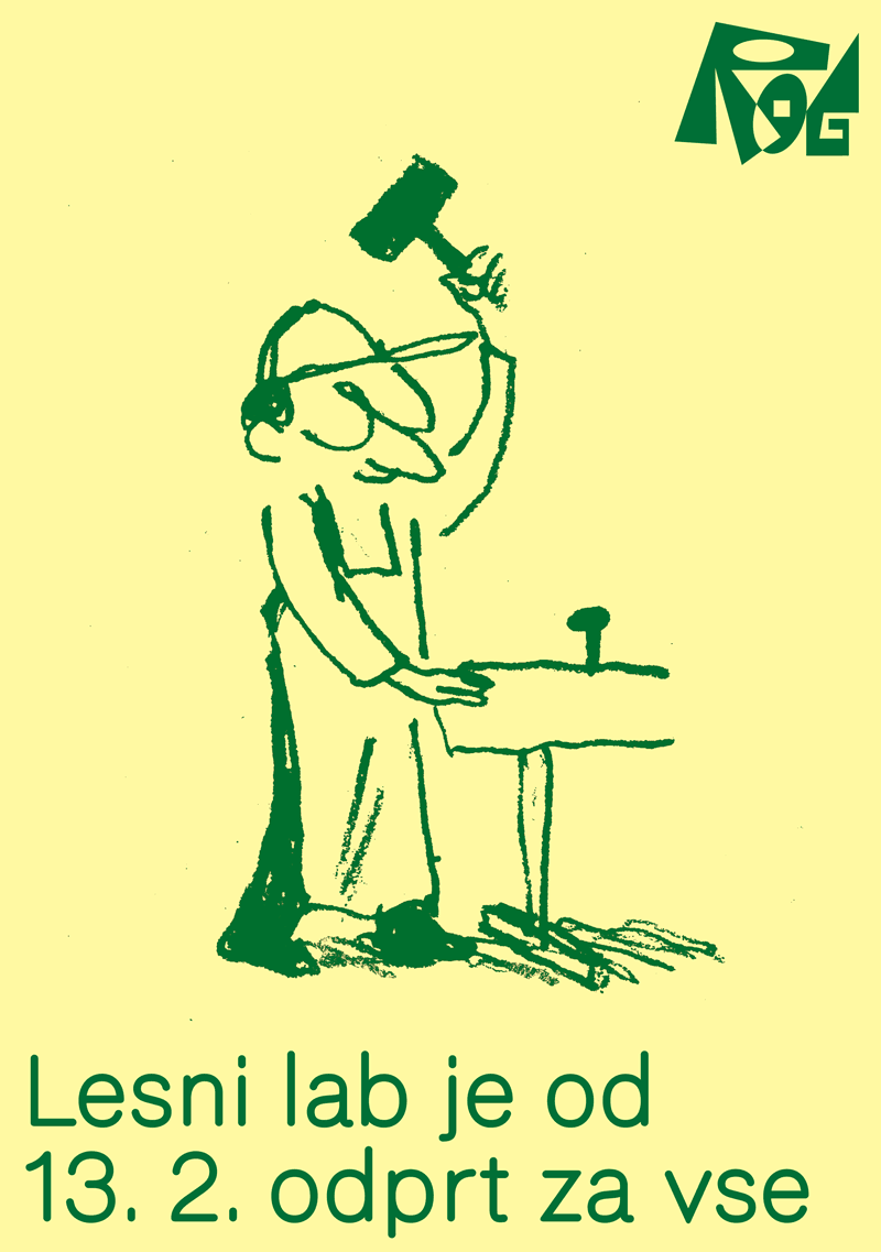
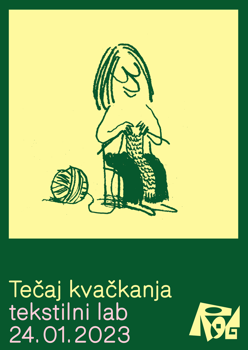
The identity includes a growing collection of illustrations by Matija Medved and photography by Klemen Ilovar. Photography shows workshop details, textures, machines, and avoids showing people which could quickly look like stock imagery. Illustrations show people at work in Rog and are made in two styles, as line drawing or colored pencil illustration. These elements are spread out across platforms, often used as small stamp-sized images that hint at what Rog is.

Printed matter

South entrance with a large one-line version of the logo
A large 10m × 3m sign was installed above the main entrance. A one-line version of a logo that adapts to the facade and doesn’t block the light was drawn and transformed into a 3D piece. The tubes are a slight nod to the origins of the building, which used to be a bicycle factory.


Details of the sign above the entrance


The growing signage system consists of over 100 different signs
Given all the things that are daily happening in Rog, we knew that no matter how many rules we set, the walls would soon be filled with various signs, event identity posters, A4 notes, warning signs and other types of impromptu communication. Rather than fight it, the signage blends in. The signs are made from different materials, in various dimensions, loosely connected by typography and Rog colours. Standard signs are A4 sized, imitating a sheet of paper and decorated with bent metal plates that look like different types of duct tape.


Signage details


Edition, a typeface used in the identity, is a one-line font. One line fonts, originally engineer’s versions of standard fonts, are made as a single line where its thickness defines the weight of the letter. These types of fonts were usually made in the workshops, to be used on CNC mills, lasers, or various older screen technologies. Edition was drawn by Elias Hanzer.
Typographic motion principles
A set of icons used in the signage of the building


Icons used throughout the signage system


DIY and official signage living side by side


A selection of components on the website used for various types of information such as cookie notice, side bars or special announcements.
Rog uses a wide palette of 12 colors, organized into 4 triads. Color combinations are locked and predefined, simple rules in the brand manual are in place to avoid countless color combinations. Cool grey is used instead of white as the default background.


Printed matter with campaign graphics


Smaller outdoor branding elements


Various applications, from Made in Rog window display, to packaging for honey harvested on the roof of the building.


Custom Rog zebra crossing at the entrance to the parking garage


