Die Zeit Campus
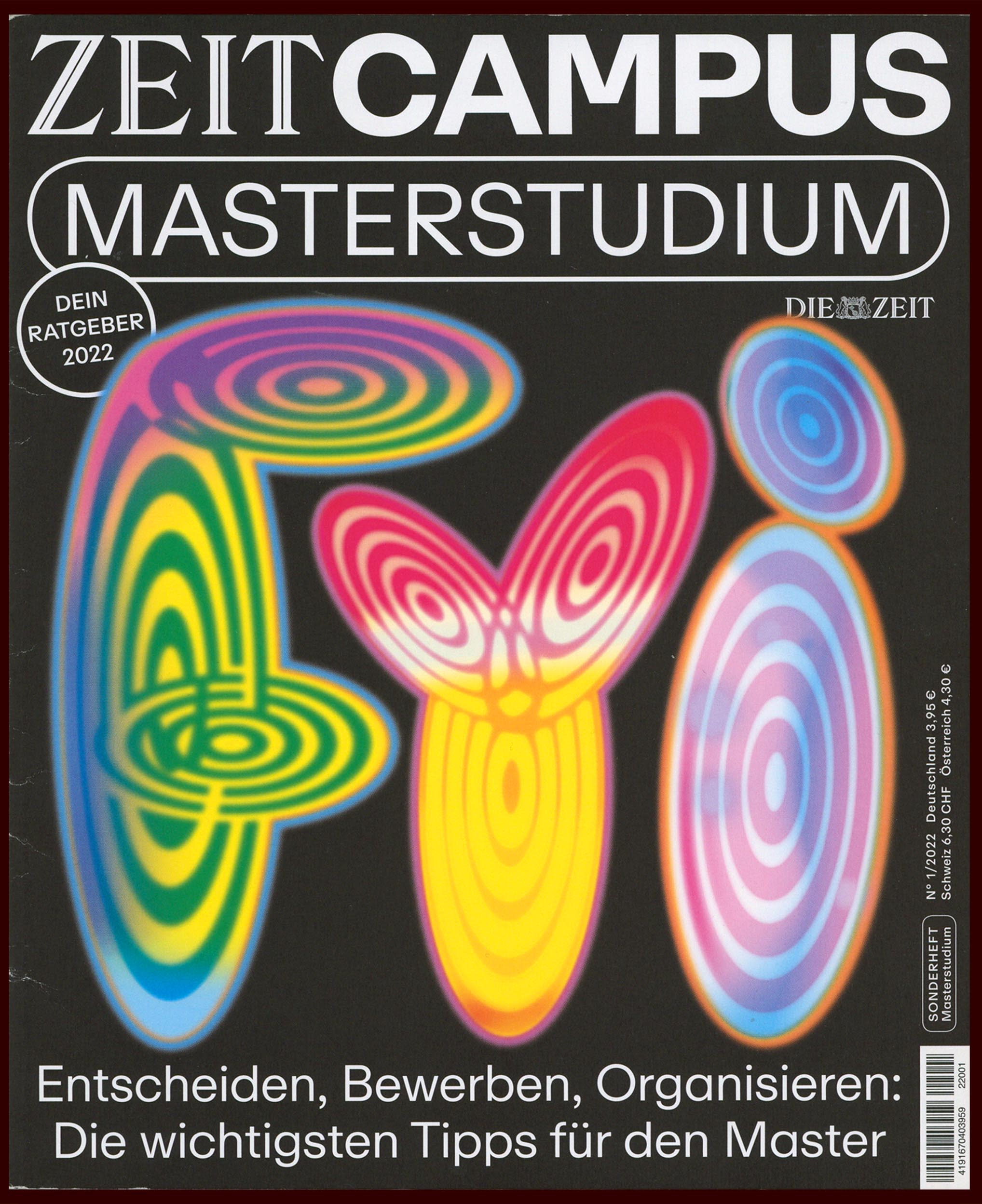
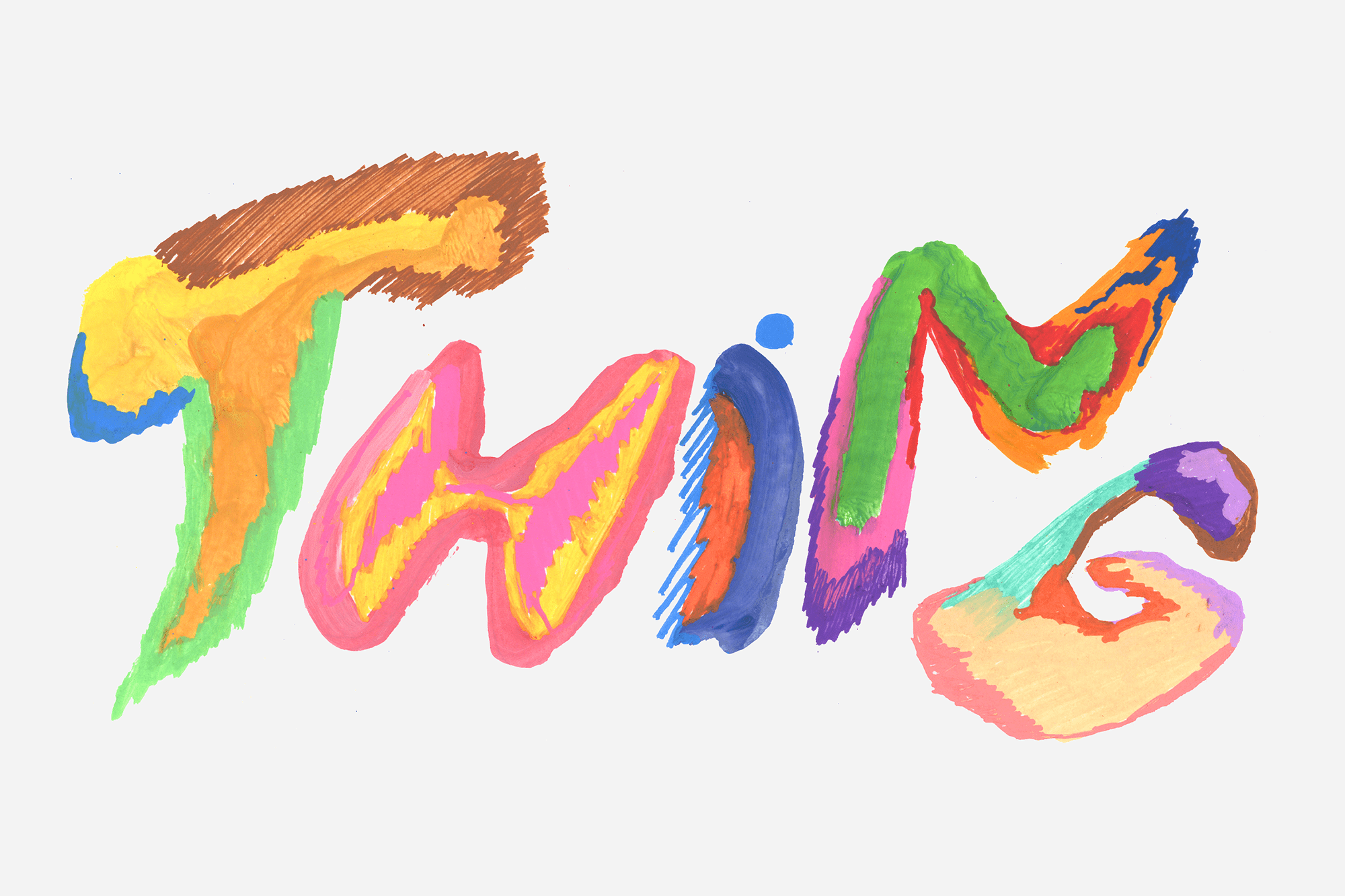
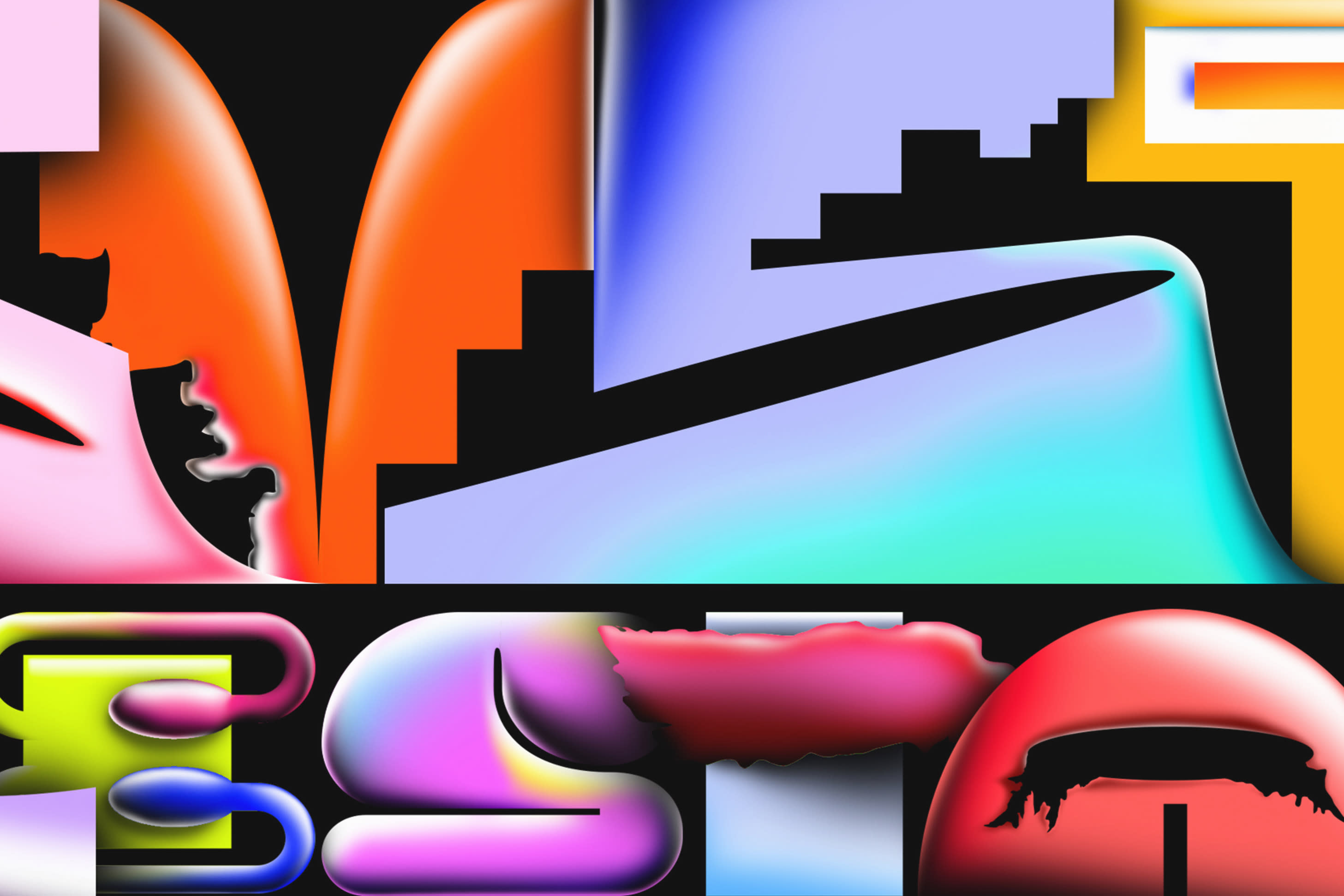
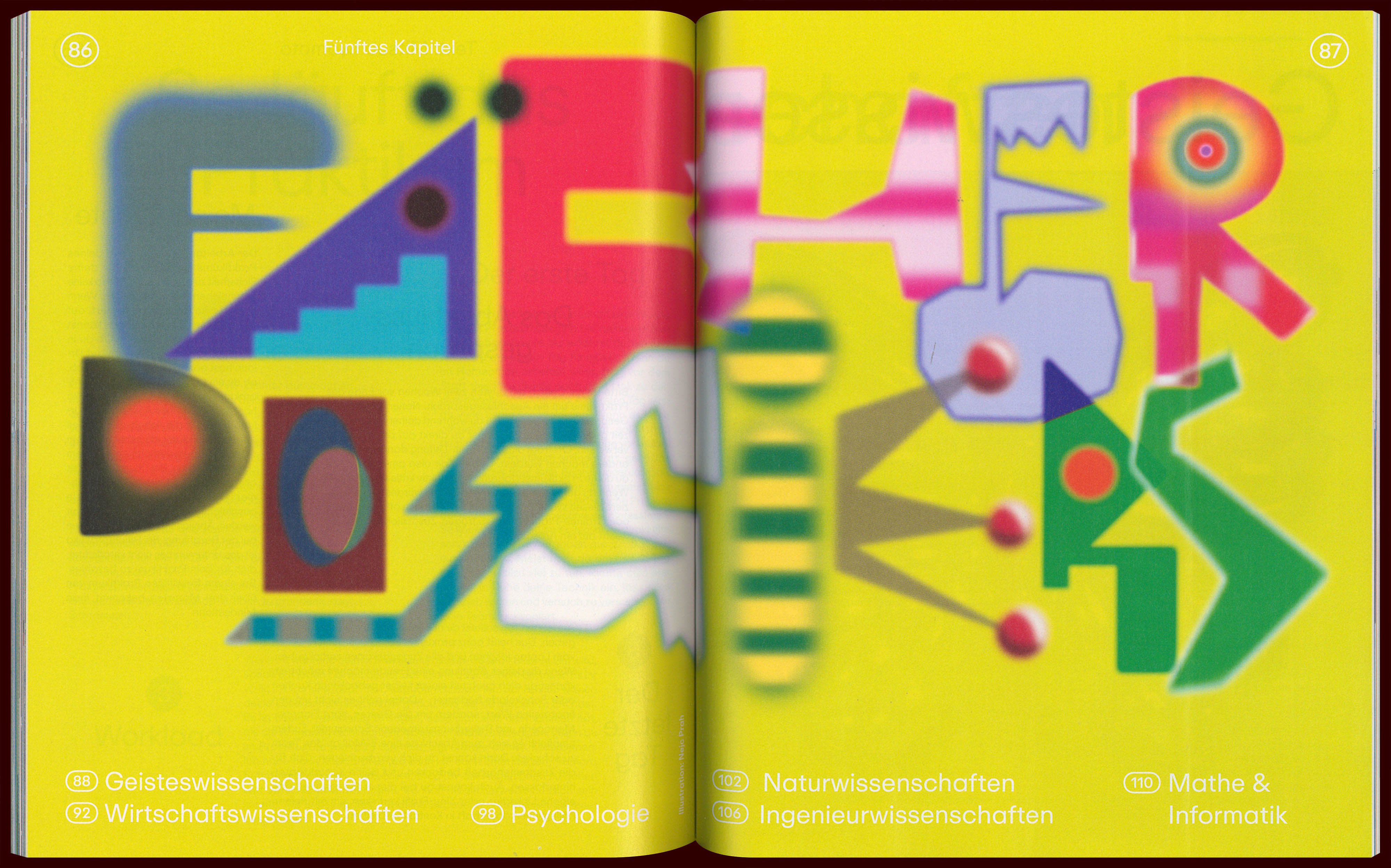
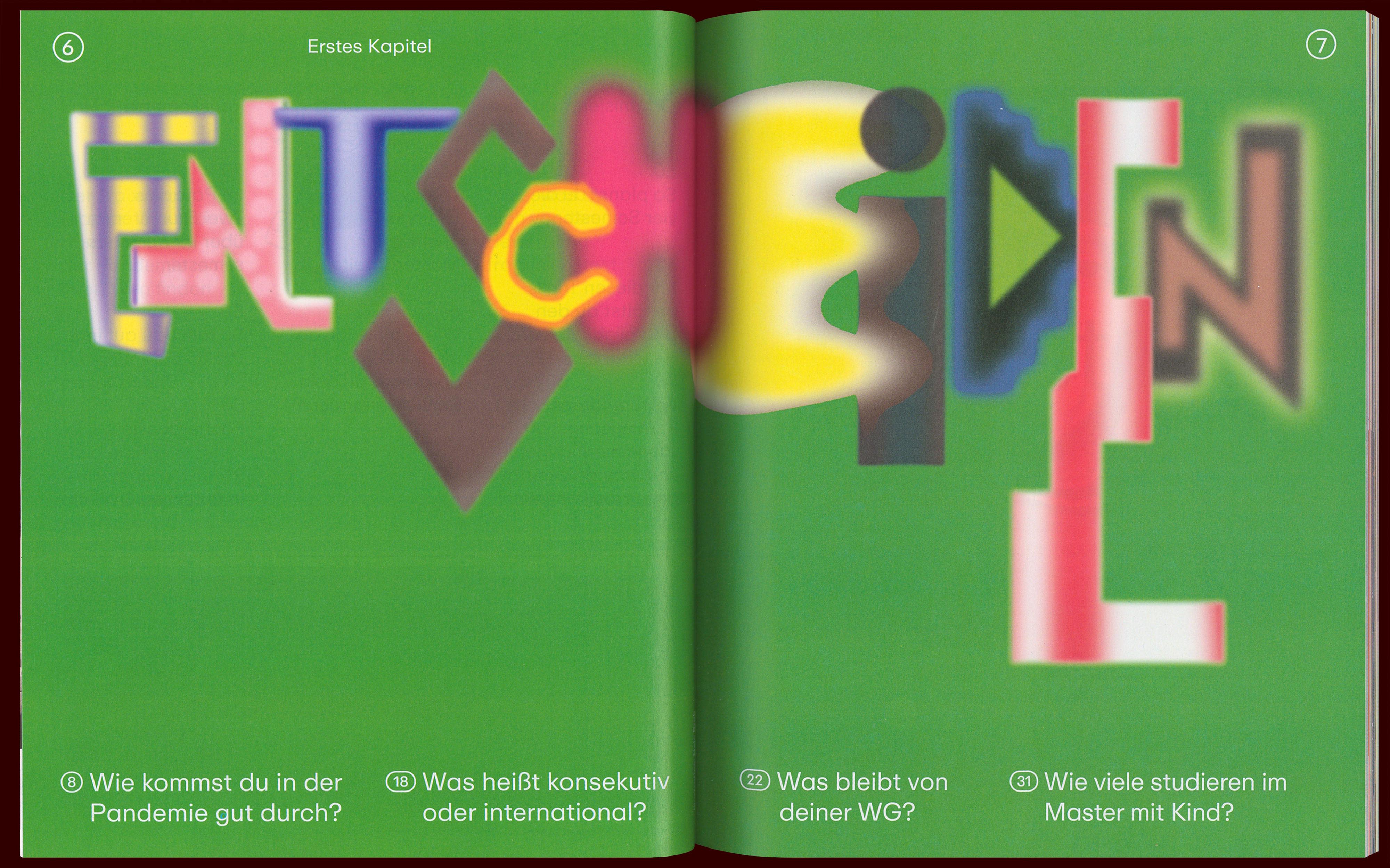
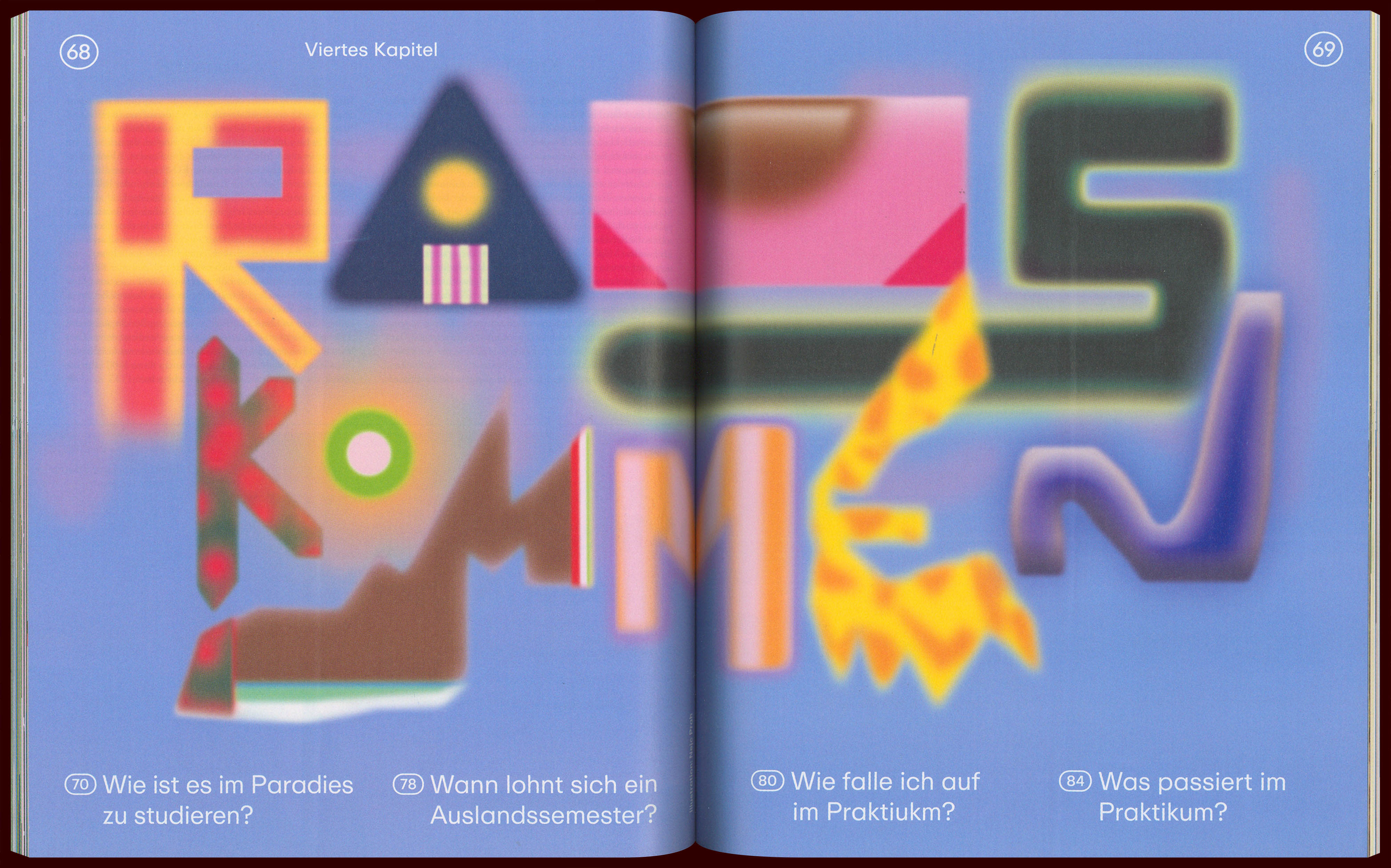
Editors at the largest German newspaper asked me to illustrate a few pages of their Campus supplement, which was aimed towards prospective master students. I developed a blurry and colourful lettering style. The “FYI” cover lettering, especially its legibility, has been debated at length before finally being approved as “not legible, but it’s ok”.
year
2022
client
Die Zeit
art direction
Lea Pürling
type
lettering
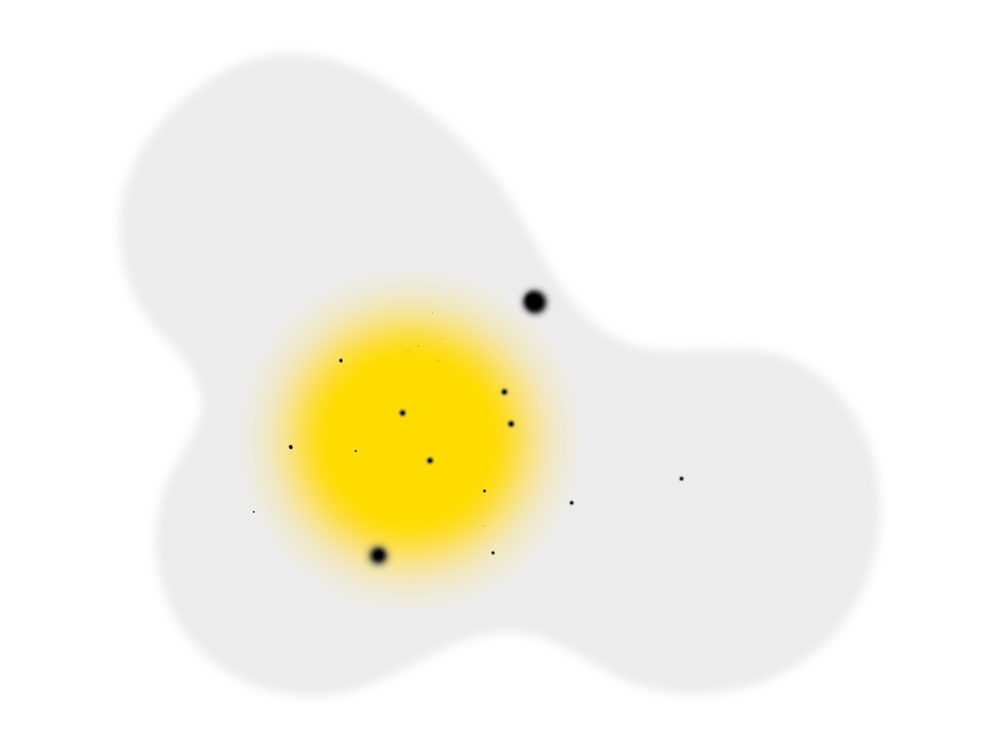
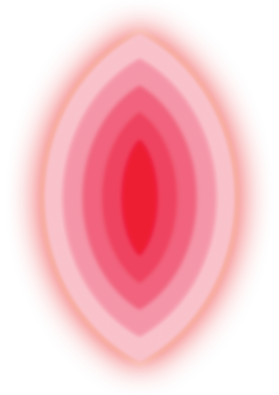
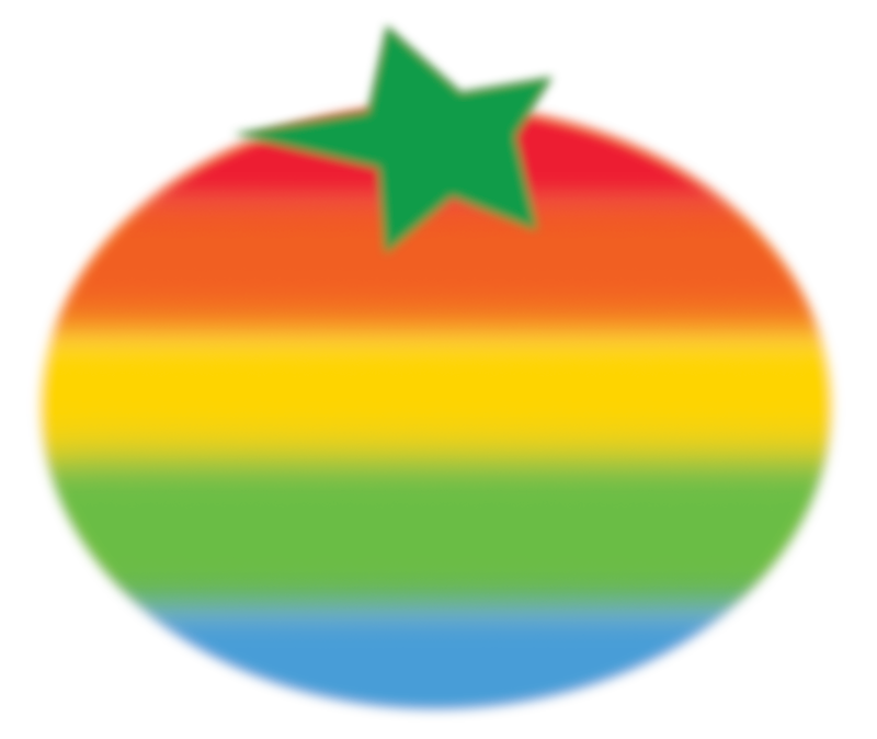
Spot illustrations (egg, vulva, tomato) were developed to further enhance the importance of choosing the right course of study

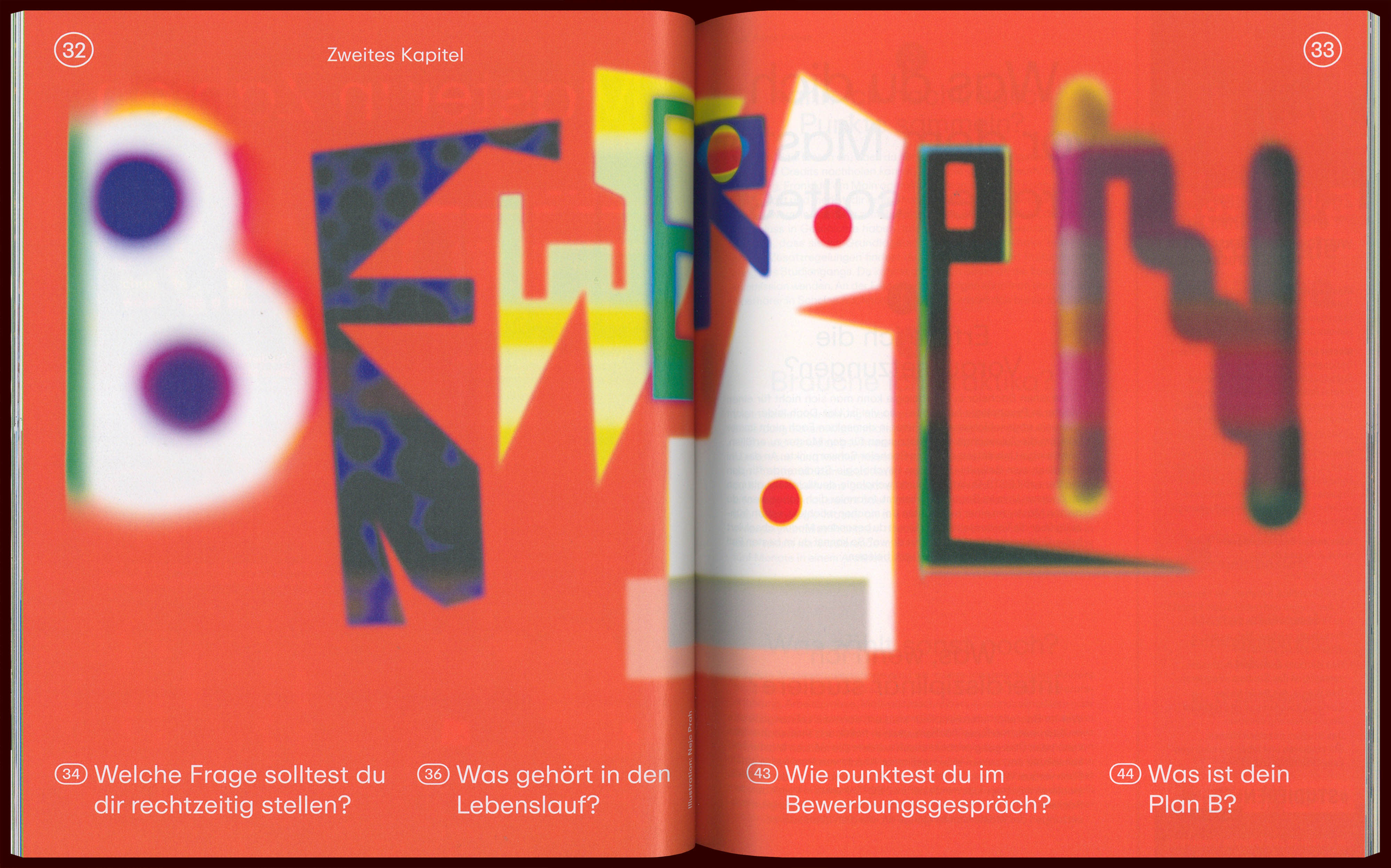
Bewerben!
Decide and get out
